
adrianfurman.com — rebranding a founder and investor website
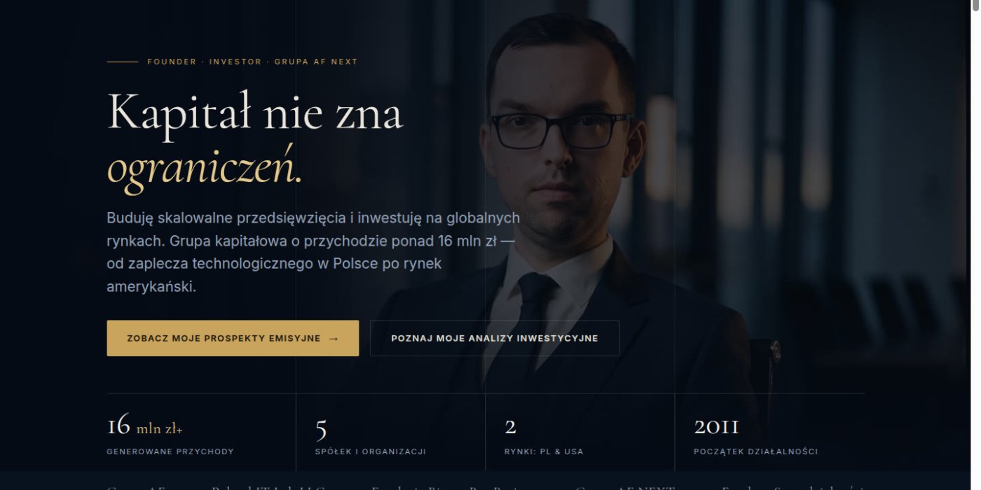
Rebranding adrianfurman.com from a personal site into a founder and investor profile. Custom WordPress theme on Timber and ACF Pro, filterable analyses, live quotes.
97
Lighthouse performance (desktop)
100
Lighthouse SEO and best practices
0
layout shift (CLS)
adrianfurman.com is the website of Adrian Furman — a founder and investor behind a capital group operating in Poland and the United States. The brief was a full rebrand: from a classic personal website into a profile that reads like an investment fund. I designed it, built a custom WordPress theme and launched it on 28 September 2026.
The brief
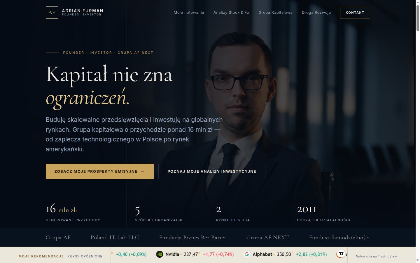
The previous site presented Adrian mainly as a public figure. The new one had to show him as an entrepreneur and investor — someone you trust with capital. The visual direction came from the client himself: the look of philanthropic funds and private banking rather than a typical "about me" page.
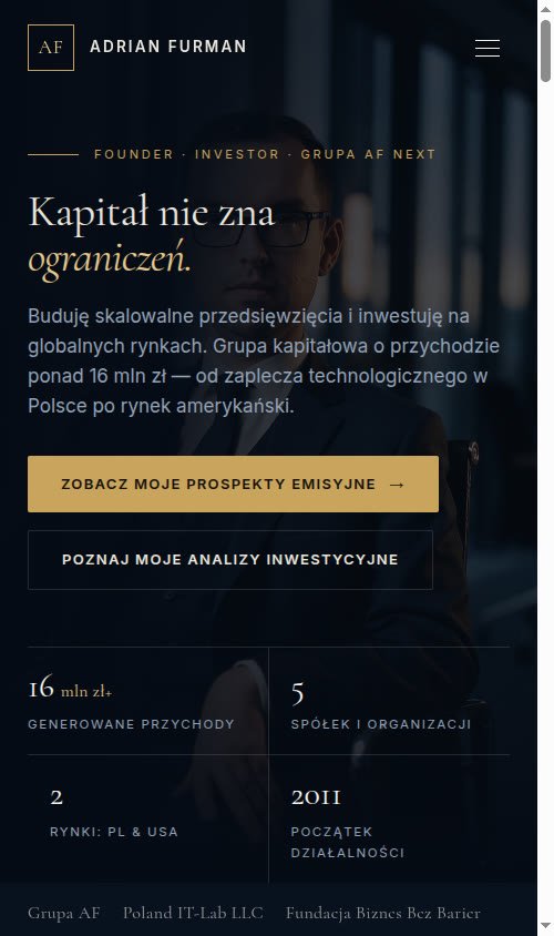
Hence navy and gold, serif headings with italics, thin grid lines, and hard numbers on the first screen: group revenue, number of companies, markets, year founded.
How I built it
First came a static mockup in plain HTML, CSS and JavaScript — quick to present and easy to change during approval. Only after sign-off did I move it into WordPress as a custom theme built on Timber (Twig) and ACF Pro. The mockup and the theme share the same CSS and JS files, so what the client approved is exactly what went live.
With ACF fields the client edits content in the WordPress dashboard — analyses, companies, figures, the timeline — without touching code or risking the layout.
What is on the site
- Live quotes — a ticker with recommendations and stock prices, fed by TradingView.
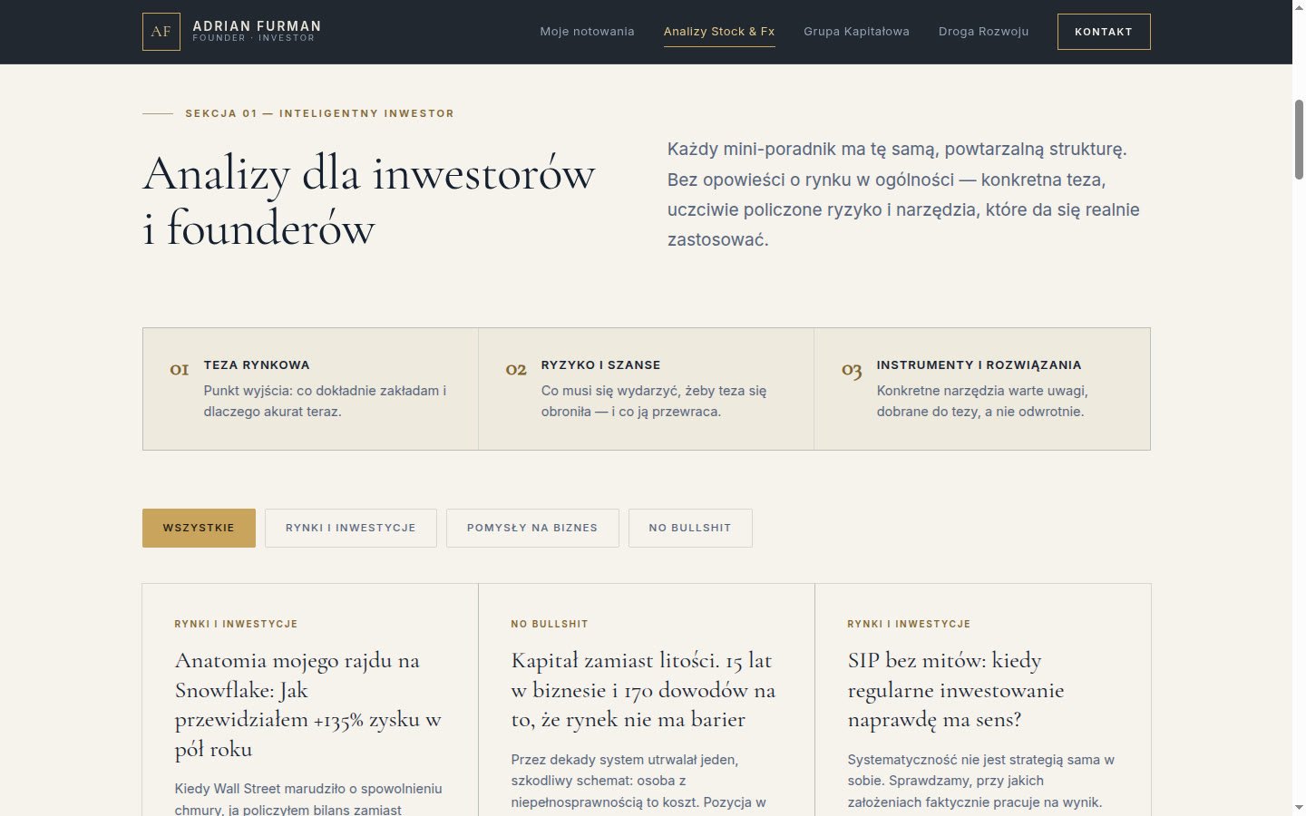
- Analyses for investors and founders — posts in several categories with a filter, each following the same structure: thesis, risks and opportunities, tools.
- Capital group — the group's companies and organisations with founding year and market, from the tech back office in Poland to the US company.
- Contact — profile icons and an email address revealed on click instead of a form.
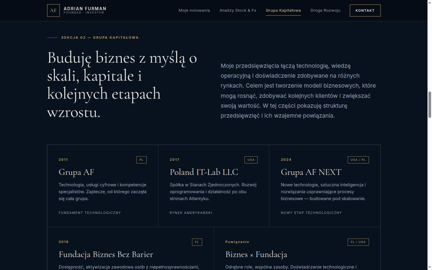
The graphics on the site were generated with AI for this project instead of using stock photos, so they share one visual language with the rest of the page.
Mobile
The site was designed for phones in parallel: the menu folds into a button, figures arrange into a two-by-two grid, and the main buttons span the full width of the screen.
Result
In Lighthouse the site scores 97 for performance on desktop and 100 for SEO and best practices, with no layout shift while loading. For the same group I also built the website of its US company — Poland IT Lab.
Need a website that positions you the way you want to be seen? See how I approach website development.
- My role
- Design, WordPress theme and launch
- Stack
- WordPress, Timber (Twig), ACF Pro, AI-generated graphics
- Live
- www.adrianfurman.com
You might also be interested in
Related pages

blog
Ready-made Make automation: publishing blog posts in WordPress
Today I'm sharing a ready-made Make.com automation with you. Instead of manually tracking news, writing articles, creating graphics, optimizing for SEO, and man…

blog
Wordpress 5.0 released ! What's new ?
After months of hard work, testing, beta and release candidate versions, Wordpress 5.0 is out ! Interested in new features it can offer ? Take a quick tour belo…

blog
WordPress Website Maintenance? Why It Matters
Many website owners treat their site as a one-time project. Meanwhile, website maintenance, especially for WordPress, is an absolute necessity.